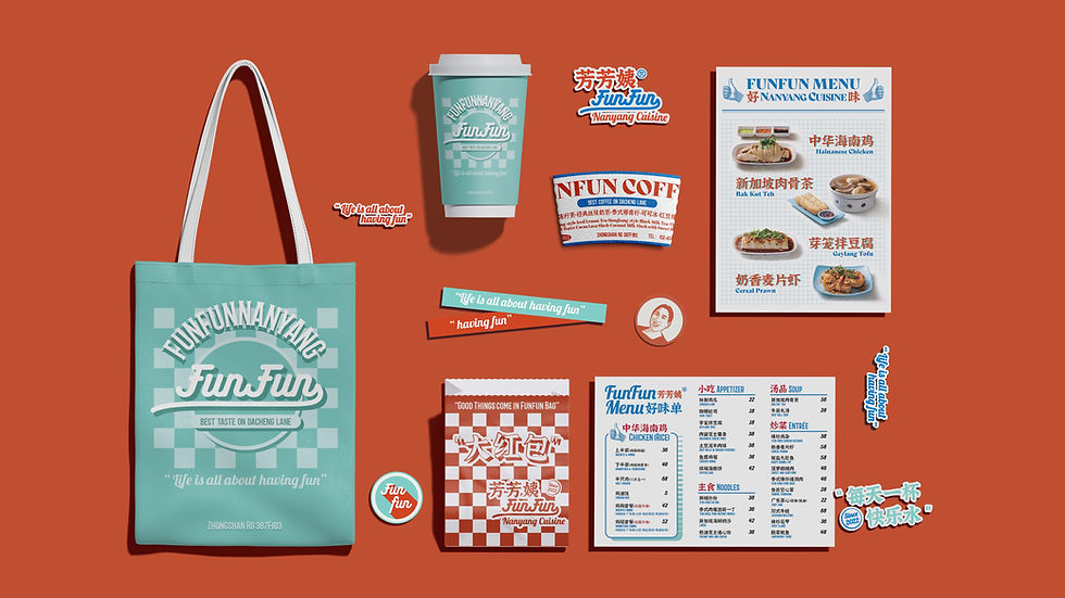
FunFun
A brand launch for a single-store Nanyang eatery styled after overseas Chinatowns, a familiar look abroad but novel and exotic in China. I built a street-stopping visual identity to draw walk-ins and amplify reach without paid media.
Brand Identity
Visual Strategy
Cultural Positioning
High-Visibility Design
600+
User-generated posts
in first three months
Curiosity
Walk-ins sparked
by visual intrigue
Timewarp
Overseas Chinatown style,
exotic in China
Context
FunFun is located in Wuxi's busiest pedestrian street. Founder Auntie Fangfang (芳芳姨) returned home after many years in Singapore, bringing back Nanyang cuisine. This style was created by Chinese immigrants in Southeast Asia, blending their traditions with local flavors. It is a reverse cultural import, familiar abroad yet novel in China in both taste and look.
The challenge is that Nanyang cuisine is still unfamiliar in the local market, and as a single shop without the scale or budgets of a chain, it is harder to stand out.
What if Auntie Fangfang’s warm, outspoken voice turned unfamiliar flavors into curiosity, and shareable moments into first visits and word-of-mouth?
Strategy
Bring back Southeast Asian Chinese flavors to the city’s everyday dining, voiced through Auntie Fangfang with a warm, direct and inviting tone. Make it approachable yet new.
Narrative
Lead with a warm, everyday brand voice and scenes that stay with people before the menu does.
Visibility
Use a clear visual hierarchy and layout rhythm so it’s easy to spot from afar, read up close, and remember.
Content Growth
Build in visual cues on branded materials so they’re photo-ready and shareable, boosting brand recall.
Tone of Voice
-
Warm and lively
-
Direct and welcoming, like a neighbor inviting you to eat
-
With a dash of social-media-friendly humor
Design Principle
-
Readable – Large, sign-style titles for street visibility
-
Memorable – Bold contrast and layered type create market-like energy
-
Shareable – Photo-ready touchpoints (cups, bags, menus, windows)
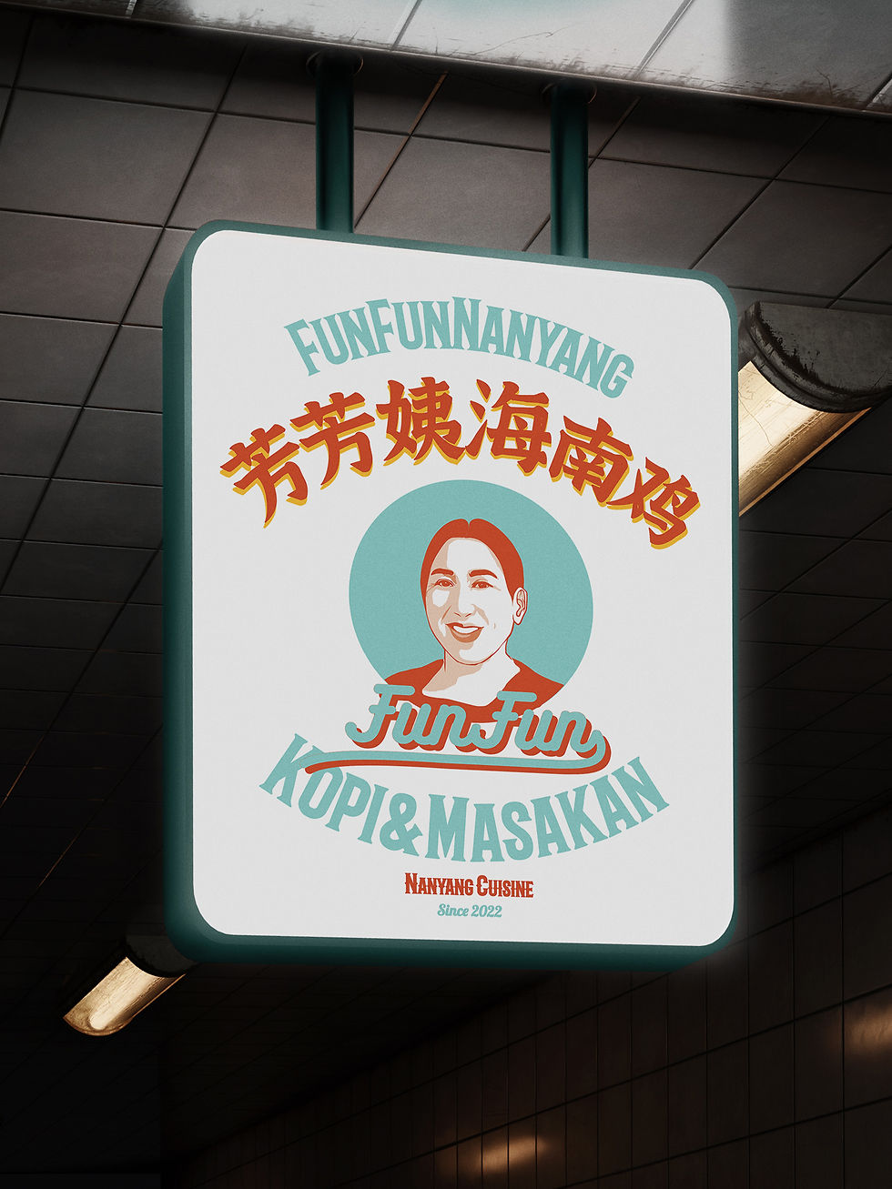
Funfun Logo System

Applications
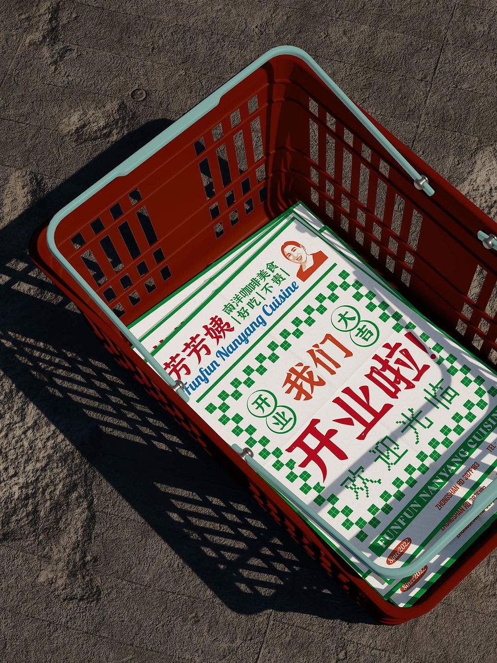
On the opening poster:
‘We’re open! Welcome in.’


On the egg tart box: ‘趁热吃’ (‘Eat while it’s warm’), a caring tip from Auntie Fangfang.

On the takeout bag: ‘大红包’ (‘Big Red Envelope’), referencing the Chinese tradition of gifting red envelopes as symbols of good luck.
%20%E6%8B%B7%E8%B4%9D.jpg)
On the back of the staff T-shirt:
‘Need something?
Auntie Fangfang’s here.’

Hover or tap the image for the meaning of the Chinese text
Narrative drives recognition
Visuals anchor memory
Voice & product spark sharing

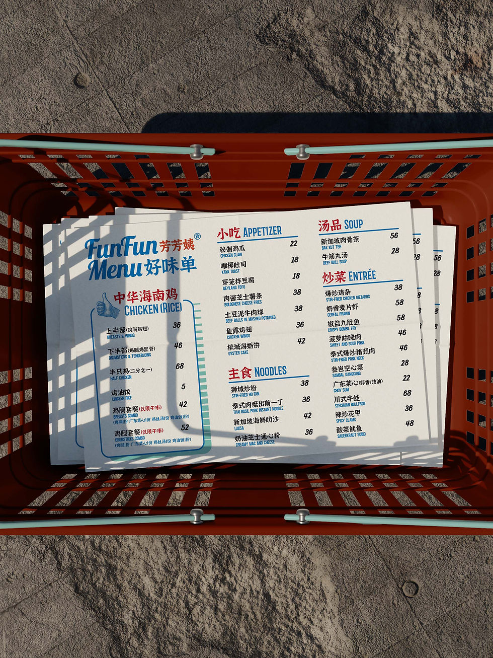
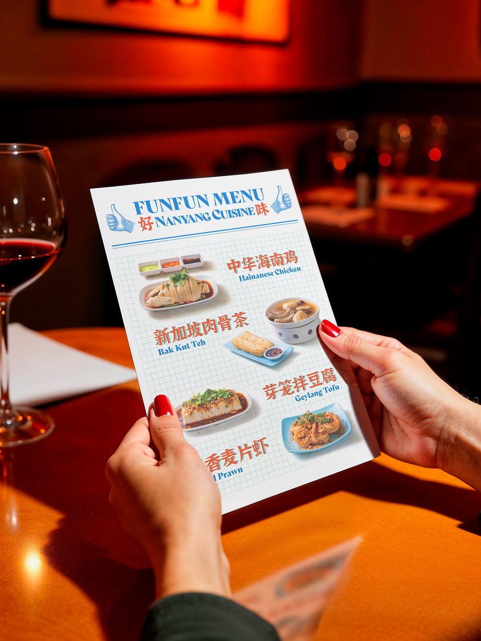
The menu is playfully named ‘好味单’, with ‘好味’ being a southern Chinese dialect for ‘delicious’


Free FunFun stickers for guests to play with and share, extending the brand’s reach.

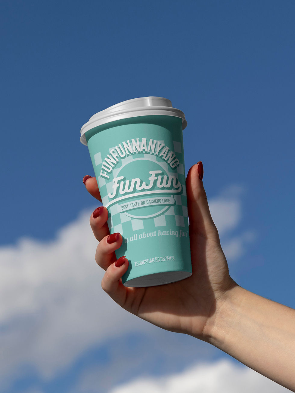

Hover or tap the image for the meaning of the Chinese text
