Light of Passion
A spring/summer collection using marketing analysis to identify challenges in Marco Bologna’s positioning and translate those insights into designs that balance dramatic stage appeal with everyday wearability.
Womenswear
Marketing & Brand Strategy
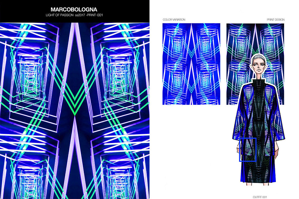
Print Design
Best
Selected as the best
design in the project
Branding
Built foundation
for future brand work
Pivot
From design execution
to brand vision
These cultures speak in resonance.
Each asks the same question:
How can wearable forms encode identity, community,
and our place in the cosmos?
For me as a designer,
the harmony of cloak, color, craft, and geometry
revealed how distant cultures can speak in parallel,
weaving shared human truths into material form.
Background
Marco Bologna is a Milan-based womenswear brand founded in 2011, recognized for its bold prints, vibrant colors, and stage-inspired femininity.
This project was produced during my Master’s at Istituto Marangoni in Milan, in an industry-modeled program that paired design development with a marketing course. The project required not only to create a collection but also to analyze the brand’s market position, identify challenges, and simulate strategic opportunities to be translated into design.
The collection was independently developed by me, following the same process expected of in-house designers.
Design Brief
On the basis of Marco Bologna’s DNA of sexy, independent, stage-ready energy, conduct market research to identify challenges and propose a Spring/Summer collection that both responds to these issues and creates new opportunities.
Design Concept
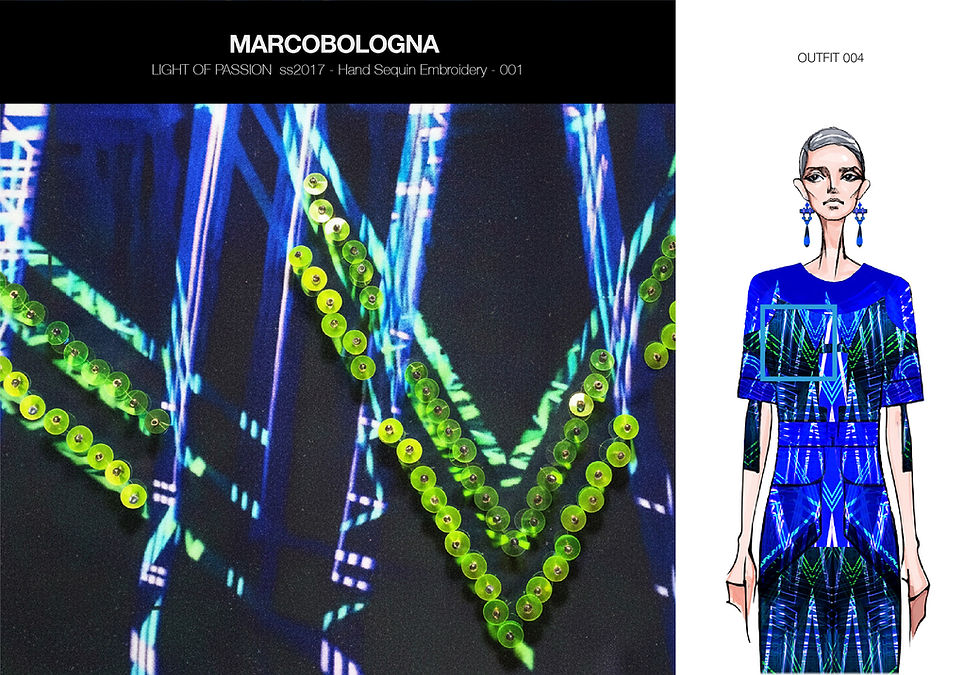
Grounded in these findings, I identified stage energy as a key opportunity to strengthen Marco Bologna’s identity. The lights, neon, and aura of live performances echo the brand’s stage-inspired DNA while offering a bold, distinctive direction. By abstracting this energy into prints, colors, and silhouettes, the collection creates a recognizable signature that balances everyday wearability with dramatic stage appeal.
-
Stage lights: abstract prints and neon colors to boost recognition
-
Star power: waist-focused dresses and sets that project confidence and sensuality
-
Stage vs. street: balance dramatic details with everyday wearability
-
Progression: a color journey from electric blue to neon pink, symbolizing the flow from daywear to stage-ready looks

Large draped textiles in these cultures carry the same weight: visually an act of covering, and symbolically a way of granting identity and protection.
Textile & Surface Design
01. Print Design


02. Embellishment Swatches


Collection Lineup

Technical Sheet


Marketing Insights
01. Identity & Awareness
Low awareness and weak distinctiveness in multi-brand retail, positioned as a “Question Mark” on the BCG map.
02. Pricing Architecture
Past seasons have shown irregular pricing and a low perceived value. This project reorganizes pricing and defines a balanced product mix: about 75% ready-to-wear pieces with everyday versatility and 25% high-impact styles.
03. Channel Reality
Primarily sold through multibrand and online, lack of mono-brand presence reduces brand identity at point of sale.

Large draped textiles in these cultures carry the same weight: visually an act of covering, and symbolically a way of granting identity and protection.